Layouts and Menus
Complex UI's require many controls. It is likely these controls need to be grouped, positioned, and sized with set policies. Fortunately TornadoFX streamlines many layouts that come with JavaFX, as well as features its own proprietary Form layout.
TornadoFX also has type-safe builders to create menus in a highly structured, declarative way. Menus can be especially cumbersome to build using conventional JavaFX code, and Kotlin really shines in this department.
Builders for Layouts
Layouts group controls and set policies about their sizing and positioning behavior. Technically, layouts themselves are controls so therefore you can nest layouts inside layouts. This is critical for building complex UI's, and TornadoFX makes maintenance of UI code easier by visibly showing the nested relationships.
VBox
A VBox stacks controls vertically in the order they are declared inside its block (Figure 7.1).
vbox {
    button("Button 1").setOnAction {
        println("Button 1 Pressed")
    }
    button("Button 2").setOnAction {
        println("Button 2 Pressed")
    }
}
Figure 7.1

You can also call vboxConstraints() within a child's block to change the margin and vertical growing behaviors of the VBox.
vbox {
    button("Button 1") {
         vboxConstraints {
            marginBottom = 20.0
            vGrow = Priority.ALWAYS
          }
    }
    button("Button 2")
}
You can use a shorthand extension property for vGrow without calling vboxConstraints().
vbox {
    button("Button 1") {
           vGrow = Priority.ALWAYS
    }
    button("Button 2")
}
HBox
HBox behaves almost identically to VBox, but it stacks all controls horizontally left-to-right in the order declared in its block.
hbox {
    button("Button 1").setOnAction {
        println("Button 1 Pressed")
    }
    button("Button 2").setOnAction {
        println("Button 2 Pressed")
    }
}
Figure 7.2

You can also call hboxconstraints() within the a child's block to change the margin and horizontal growing behaviors of the HBox.
hbox {
    button("Button 1") {
        hboxConstraints {
                marginRight = 20.0
          hGrow = Priority.ALWAYS
      }
    }
    button("Button 2")
}
You can use a shorthand extension property for hGrow without calling hboxConstraints().
hbox {
    button("Button 1") {
          hGrow = Priority.ALWAYS
    }
  button("Button 2")
}
FlowPane
The FlowPane lays out controls left-to-right and wraps to the next line on the boundary. For example, say you added 100 buttons to a FlowPane (Figure 7.3). You will notice it simply lays out buttons from left-to-right, and when it runs out of room it moves to the "next line".
flowpane {
   for (i in 1..100) {
        button(i.toString()) {
            setOnAction { println("You pressed button $i") }
        }
   }
}
Figure 7.3

Notice also when you resize the window, the FlowLayout will re-wrap the buttons so they all can fit (Figure 7.4)
Figure 7.4

The FlowLayout is not used often because it is often simplistic for handling a large number of controls, but it comes in handy for certain situations and can be used inside other layouts.
BorderPane
The BorderPane is a highly useful layout that divides controls into 5 regions: top, left, bottom, right, and center. Many UI's can easily be built using two or more of these regions to hold controls (Figure 7.5).
borderpane {
    top = label("TOP") {
        useMaxWidth = true
        style {
            backgroundColor += Color.RED
        }
    }

    bottom = label("BOTTOM") {
        useMaxWidth = true
        style {
            backgroundColor += Color.BLUE
        }
    }

    left = label("LEFT") {
        useMaxWidth = true
        style {
            backgroundColor += Color.GREEN
        }
    }

    right = label("RIGHT") {
        useMaxWidth = true
        style {
            backgroundColor += Color.PURPLE
        }
    }

    center = label("CENTER") {
        useMaxWidth = true
        style {
            backgroundColor += Color.YELLOW
        }
    }
}
FIGURE 7.5

You will notice that the top and bottom regions take up the entire horizontal space, while left, center, and right must share the available horizontal space. But center is entitled to any extra available space (vertically and horizontally), making it ideal to hold large controls like TableView. For instance, you may vertically stack some buttons in the left region and put a TableView in the center region (Figure 7.6).
borderpane {
    left = vbox {
        button("REFRESH")
        button("COMMIT")
    }

    center  = tableview<Person> {
        items = listOf(
                Person("Joe Thompson", 33),
                Person("Sam Smith", 29),
                Person("Nancy Reams", 41)
        ).observable()

        column("NAME",Person::name)
        column("AGE",Person::age)
    }
}
Figure 7.6

BorderPane is a layout you will likely want to use often because it simplifies many complex UI's. The top region is commonly used to hold a MenuBar and the bottom region often holds a status bar of some kind. You have already seen center hold the focal control such as a TableView, and left and right hold side panels with any peripheral controls (like Buttons or Toolbars) not appropriate for the MenuBar. We will learn about Menus later in this section.
Form Builder
TornadoFX has a helpful Form control to handle a large number of user inputs. Having several input fields to take user information is common and JavaFX does not have a built-in solution to streamline this. To remedy this, TornadoFX has a builder to declare a Form with any number of fields (Figure 7.7).
form {
    fieldset("Personal Info") {
        field("First Name") {
            textfield()
        }
        field("Last Name") {
            textfield()
        }
        field("Birthday") {
            datepicker()
        }
    }
    fieldset("Contact") {
        field("Phone") {
            textfield()
        }
        field("Email") {
            textfield()
        }
    }
    button("Commit") {
        action { println("Wrote to database!")}
    }
}
Figure 7.7


Awesome right? You can specify one or more controls for each of the fields, and the Form will render the groupings and labels for you.
You can choose to lay out the label above the inputs as well:
fieldset("FieldSet", labelPosition = VERTICAL)
Each field represents a container with the label and another container for the input fields you add inside it. The input container is by default an HBox, meaning that
multiple inputs within a single field will be laid out next to each other. You can specify the orientation parameter to a field to make it lay out multiple inputs
below each other. Another use case for Vertical orientation is to allow an input to grow as the form expands vertically. This is handy for displaying TextAreas in Forms:
form {
    fieldset("Feedback Form", labelPosition = VERTICAL) {
        field("Comment", VERTICAL) {
            textarea {
                prefRowCount = 5
                vgrow = Priority.ALWAYS
            }
        }
        buttonbar {
            button("Send")
        }
    }
}
Figure 7.8

The example above also uses the buttonbar builder to create a special field with no label while retaining the label indent so the buttons line up under the inputs.
You bind each input to a model, and you can leave the rendering of the control layouts to the Form. For this reason you will likely want to use this over the GridPane if possible, which we will cover next.
Nesting layouts inside a Form
You can wrap both fieldsets and fields with any layout container of your choosing to create complex form layouts.
form {
    hbox(20) {
        fieldset("Left FieldSet") {
            hbox(20) {
                vbox {
                    field("Field l1a") { textfield() }
                    field("Field l2a") { textfield() }
                }
                vbox {
                    field("Field l1b") { textfield() }
                    field("Field l2b") { textfield() }
                }
            }
        }
        fieldset("Right FieldSet") {
            hbox(20) {
                vbox {
                    field("Field r1a") { textfield() }
                    field("Field r2a") { textfield() }
                }
                vbox {
                    field("Field r1b") { textfield() }
                    field("Field r2b") { textfield() }
                }
            }
        }
    }
}
The HBoxes are configured with a spacing of 20 pixels, using the parameter for the hbox builder. It can also be specified as hbox(spacing = 20) for clarity.
Figure 7.9

Using Input Filters
As a part of the TextInputControl, filterInput is a convenient way to restrict user input in form fields. filterInput accepts the changes to form fields and compares them against your filter. If the filter evaluates to true, the input is accepted. In the following example, a textfield has it's input restricted to integers between 0 and 10.
val FirstTenFilter: (TextFormatter.Change) -> Boolean = { change ->
    !change.isAdded || change.controlNewText.let {
        it.isInt() && it.toInt() in 0..10
    }
}

textfield {
    filterInput(FirstTenFilter)
}
The code above checks if change was triggered by adding new text with isAdded or evaluates the new text against an a function to determine if the text entered, it, isInt() and is within the range of 0-10. If any of the checks return false, the user input will be rejected and they will not be able to input those characters.
GridPane
If you want to micromanage the layout of your controls, the GridPane will give you plenty of that. Of course it requires more configuration and code boilerplate. Before proceeding to use a GridPane, you might want to consider using Form or other layouts that abstract layout configuration for you.
One way to use GridPane is to declare the contents of each row. For any given Node you can call its gridpaneConstraints to configure various GridPane behaviors for that Node, such as margin and columnSpan (Figure 7.10)
 gridpane {
     row {
         button("North") {
             useMaxWidth = true
             gridpaneConstraints {
                 marginBottom = 10.0
                 columnSpan = 2
             }
         }
     }
    row {
        button("West")
        button("East")
    }
    row {
        button("South") {
            useMaxWidth = true
            gridpaneConstraints {
                marginTop = 10.0
                columnSpan = 2
            }
        }
    }
}
Figure 7.11

Notice how there is a margin of 10.0 between each row, which was declared for the marginBottom and marginTop of the "North" and "South" buttons respectively inside their gridpaneConstraints.
Alternatively, you can explicitly specify the column/row index positions for each Node rather than declaring each row of controls. This will accomplish the exact layout we built previously, but with column/row index specifications instead. It is a bit more verbose, but it gives you more explicit control over the positions of controls.
gridpane {
     button("North") {
         useMaxWidth = true
         gridpaneConstraints {
             columnRowIndex(0,0)
             marginBottom = 10.0
             columnSpan = 2
         }
     }
    button("West").gridpaneConstraints {
        columnRowIndex(0,1)
    }
    button("East").gridpaneConstraints {
        columnRowIndex(1,1)
    }

    button("South") {
        useMaxWidth = true
        gridpaneConstraints {
            columnRowIndex(0,2)
            marginTop = 10.0
            columnSpan = 2
        }
    }
}
These are all the gridpaneConstraints attributes you can modify on a given Node. Some are expressed as simple properties that can be assigned while others are assignable through functions.
| Attribute | Description |
|---|---|
| columnIndex: Int | The column index for the given control |
| rowIndex: Int | The row index for the given control |
| columnRowIndex(columnIndex: Int, rowIndex: Int) | Specifes the row and column index |
| columnSpan: Int | The number of columns the control occupies |
| rowSpan: Int | The number of rows the control occupies |
| hGrow: Priority | The horizonal grow priority |
| vGrow: Priority | The vertical grow priority |
| vhGrow: Priority | Specifies the same priority for vGrow and hGrow |
| fillHeight: Boolean | Sets whether the Node fills the height of its area |
| fillWidth: Boolean | Sets whether the Node filles the width of its area |
| fillHeightWidth: Boolean | Sets whether the Node fills its area for both height and width |
| hAlignment: HPos | The horizonal alignment policy |
| vAlignment: VPos | The vertical alignment policy |
| margin: Int | The margin for all four sides of the Node |
| marginBottom: Int | The margin for the bottom side of the Node |
| marginTop: Int | The margin for the top side of the Node |
| marginLeft: Int | The left margin for the left side of the Node |
| marginRight: Int | The right margin for the right side of the Node |
| marginLeftRight: Int | The right and left margins for the Node |
| marginTopBottom: Int | The top and bottom marins for a Node |
Additionally, if you need to configure ColumnConstraints, you can call gridpaneColumnConstraints on any child Node, or constraintsForColumn(columnIndex) on the GridPane itself.
gridpane {
    row {
        button("Left") {
            gridpaneColumnConstraints {
                percentWidth = 25.0
            }
        }

        button("Middle")
        button("Right")
    }
    constraintsForColumn(1).percentWidth = 50.0
}
StackPane
A StackPane is a layout you will use less often. For each control you add, it will literally stack them on top of each other not like a VBox, but literally overlay them.
For instance, you can create a "BOTTOM" Button and put a "TOP" Button on top of it. The order you declare controls will add them from bottom-to-top in that same order (Figure 7.10).
class MyView: View() {

    override val root =  stackpane {
        button("BOTTOM") {
           useMaxHeight = true
           useMaxWidth = true
           style {
               backgroundColor += Color.AQUAMARINE
               fontSize = 40.0.px
           }
        }

        button("TOP") {
            style {
                backgroundColor += Color.WHITE
            }
        }
    }
}
Figure 7.11

TabPane
A TabPane creates a UI with different screens separated by "tabs". This allows switching between different screens quickly and easily by clicking on the corresponding tab (Figure 7.11). You can declare a tabpane() and then declare as many tab() instances as you need. For each tab() function you will build your hierarchy of nodes inside, starting with the container node.
 tabpane {
    tab("Screen 1") {
        vbox {
            button("Button 1")
            button("Button 2")
        }
    }
    tab("Screen 2") {
        hbox {
            button("Button 3")
            button("Button 4")
        }
    }
}
Figure 7.12


TabPane is an effective tool to separate screens and organize a high number of controls. The syntax is somewhat succinct enough to declare complex controls like TableView right inside the tab() block (Figure 7.13).
tabpane {
  tab("Screen 1") {
      vbox {
          button("Button 1")
          button("Button 2")
      }
  }
  tab("Screen 2") {
      tableview<Person> {
          items = listOf(
              Person(1,"Samantha Stuart",LocalDate.of(1981,12,4)),
              Person(2,"Tom Marks",LocalDate.of(2001,1,23)),
              Person(3,"Stuart Gills",LocalDate.of(1989,5,23)),
              Person(3,"Nicole Williams",LocalDate.of(1998,8,11))
          ).observable()

          column("ID",Person::id)
          column("Name", Person::name)
          column("Birthday", Person::birthday)
          column("Age",Person::age)
      }
  }
}
Figure 7.13

Like many builders, the TabPane has several properties that can adjust the behavior of its tabs. For instance, you can call tabClosingPolicy to get rid of the "X" buttons on the tabs so they cannot be closed.
class MyView: View() {
    override val root =  tabpane {
        tabClosingPolicy = TabPane.TabClosingPolicy.UNAVAILABLE

        tab("Screen 1") {
            vbox {
                button("Button 1")
                button("Button 2")
            }
        }
        tab("Screen 2") {
            hbox {
                button("Button 3")
                button("Button 4")
            }
        }
    }
}
Using UIComponents as tabs
You can also embed other UIComponents like Fragments and Views in your Tabs, simply by adding them with either the generic add function or the specialized tab function:
class MyView : View("My TabPane") {
    override val root = tabpane {
        tab<Screen1>()
        tab<Screen2>()
    }
}

class Screen1 : Fragment("Screen 1") {
    override val root = vbox {
        button("Button 1")
        button("Button 2")
    }
}

class Screen2 : Fragment("Screen 2") {
    override val root = vbox {
        button("Button 3")
        button("Button 4")
    }
}
This strategy promotes reuse and keeps your UI code cleaner.
Builders for Menus
Creating menus can be cumbersome to build in a strictly object-oriented way. But using type-safe builders, Kotlin's functional constructs make it intuitive to declare nested menu hierarchies.
MenuBar, Menu, and MenuItem
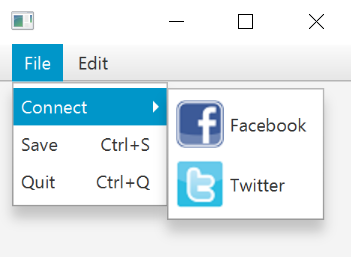
It is not uncommon to use navigable menus to keep a large number of commands on a user interface organized. For instance, the top region of a BorderPane is typically where a MenuBar goes. There you can add menus and submenus easily (Figure 7.5).
menubar {
   menu("File") {
       menu("Connect") {
           item("Facebook")
           item("Twitter")
       }
       item("Save")
       item("Quit")
   }
   menu("Edit") {
       item("Copy")
       item("Paste")
   }
}
Figure 7.14

You can also optionally provide keyboard shortcuts, graphics, as well as an action function parameter for each item() to specify the action when it is selected (Figure 7.14).
menubar {
     menu("File") {
         menu("Connect") {
             item("Facebook", graphic = fbIcon).action { println("Connecting Facebook!") }
             item("Twitter", graphic = twIcon).action { println("Connecting Twitter!") }
         }
         item("Save","Shortcut+S").action {
             println("Saving!")
         }
         item("Quit","Shortcut+Q").action {
             println("Quitting!")
         }
     }
     menu("Edit") {
         item("Copy","Shortcut+C").action {
             println("Copying!")
         }
         item("Paste","Shortcut+V").action {
             println("Pasting!")
         }
     }
 }
Figure 7.14
Separators
You can declare a separator() between two items in a Menu to create a divider line. This is helpful to group commands in a Menu and distinctly separate them (Figure 7.15).
 menu("File") {
     menu("Connect") {
         item("Facebook")
         item("Twitter")
     }
     separator()
     item("Save","Shortcut+S").action {
         println("Saving!")
     }
     item("Quit","Shortcut+Q").action {
         println("Quitting!")
     }
 }
Figure 7.15

ContextMenu
Most controls in JavaFX have a contextMenu property where you can assign a ContextMenu instance. This is a Menu that pops up when the control is right-clicked.
A ContextMenu has functions to add Menu and MenuItem instances to it just like a MenuBar. It can be helpful to add a ContextMenu to a TableView<Person>, for example, and provide commands to be done on a table record (Figure 7.16). There is
a builder called contextmenu that will build a ContextMenu and assign it to the contextMenu property of the control.
tableview(persons) {
     column("ID", Person::idProperty)
     column("Name", Person::nameProperty)
     column("Birthday", Person::birthdayProperty)
     column("Age", Person::ageProperty)

     contextmenu {
         item("Send Email").action {
             selectedItem?.apply { println("Sending Email to $name") }
         }
         item("Change Status").action {
             selectedItem?.apply { println("Changing Status for $name") }
         }
     }
 }
Figure 7.16

Note there are also
RadioMenuItemandCheckMenuItemvariants ofMenuItemavailable.
The menuitem builders take the action to perform when the menu is selected as the op block parameter. Unfortunately, this breaks with the other builders, where the op block operates on the
element that the builder created. Therefore, the item builder was introduced as an alternative, where you operate on the item itself, so that you must call setOnAction to assign the action.
The menuitem builder is not deprecated, as it solves the common case in a more concise way than the item builder.
ListMenu
TornadoFX comes with a list menu that behaves and looks more like a typical ul/li based HTML5 menu.

The following code example shows how to use the ListMenu with the builder pattern:
listmenu(theme = "blue") {
    item(text = "Contacts", graphic = Styles.contactsIcon()) {
        // Marks this item as active.
        activeItem = this
        whenSelected { /* Do some action */ }
    }
    item(text = "Projects", graphic = Styles.projectsIcon())
    item(text = "Settings", graphic = Styles.settingsIcon())
}
The following Attributes can be used to configure the ListMenu:
| Attribute | Builder-Attribute | Type | Default | Description |
|---|---|---|---|---|
| orientation | yes | Orientation | VERTICAL | Configures the orientation of the ListMenu. Possible orientations:
|
| iconPosition | yes | Side | LEFT | Configures the icon position of the ListMenu. Possible positions:
|
| theme | yes | String | null | Currently supported themes blue, null. If null is set the default gray theme is used. |
| tag | yes | Any? | null | The Tag can be any object or null, it can be useful to identify the ListMenu |
| activeItem | no | ListMenuItem? | null | Represent's the current active ListMenuItem of the ListMenu. To select a ListMenu on creation, just assign the specific ListItem to this property (have a look at the contacts ListMenuItem in the code example above.) |
Css Properties
| Css-Class | Css-Property | Default | Description |
|---|---|---|---|
.list-menu |
-fx-graphic-fixed-size | 2em | The graphic size. |
.list-menu .list-item |
-fx-cursor | hand | The cursor symbol. |
.list-menu .list-item |
-fx-padding | 10 | The padding for each item |
.list-menu .list-item |
-fx-background-color | -fx-shadow-highlight-color, -fx-outer-border, -fx-inner-border, -fx-body-color | The color of the item |
.list-menu .list-item |
-fx-background-insets | 0 0 -0.5 0, 0, 0.5, 1.5 | The insets of each item. |
.list-menu .list-item .label |
-fx-text-fill | -fx-text-base-color | The text color of each item. |
Pseudo Classes
| Pseudo-Class | Css-Property | Default | Description |
|---|---|---|---|
.list-menu .list-item:active |
-fx-background-color | -fx-focus-color, -fx-inner-border, -fx-body-color, -fx-faint-focus-color, -fx-body-color | The color will be set if the item is active. |
.list-menu .list-item:active |
-fx-background-insets | -0.2, 1, 2, -1.4, 2.6 | Insets will be set if the item is active. |
.list-menu .list-item:hover |
-fx-color | -fx-hover-base | The hover color. |
Have a look at the default Stylesheet for the ListMenu
Item
The item builder allows to create items for the ListMenu in a very convenient way. The following syntax is supported:
item("SomeText", graphic = SomeNode, tag = SomeObject) {
    // Marks this item as active.
    activeItem = this

    // Do some action when selected
    whenSelected { /* Action */ }
}
| Attribute | Builder-Attribute | Type | Default | Description |
|---|---|---|---|---|
| text | yes | String? | null | The text which should be set for the given item. |
| tag | yes | Any? | null | The Tag can be any object or null and can be useful to identify the ListItem |
| graphic | yes | Node? | null | The graphic can be any Node and will be displayed beside the given text. |
| Function | Description |
|---|---|
whenSelected |
A convince function, which will be called anytime the given ListMenuItem is selected. |
Filling the parent container
The useMaxWidth property can be used to fill the parent container horizontally. The useMaxHeight property will fill the parent container vertically. These properties
actually applies to all Nodes, but is especially useful for the ListMenu.
SqueezeBox
JavaFX has an Accordion control that lets you group a set of TilePanes together to form an accordion of controls. The JavaFX Accordion only lets you open a single accordion fold at a time, and it has
some other shortcomings. To solve this, TornadoFX comes with the SqueezeBox component that behaves and looks very similar to the Accordion, while providing some enhancements.
squeezebox {
    fold("Customer Editor", expanded = true) {
        form {
            fieldset("Customer Details") {
                field("Name") { textfield() }
                field("Password") { textfield() }
            }
        }
    }
    fold("Some other editor", expanded = true) {
        stackpane {
            label("Nothing here")
        }
    }
}
Figure 7.17

A Squeezebox showing two folds, both expanded by default
You can tell the SqueezeBox to only allow a single fold to be expanded at any given time by passing multiselect = false to the builder constructor.
You can optionally allow folds to be closable by clicking a cross in the right corner of the title pane for the fold. You enable the close buttons on a per fold
basis by passing closeable = true to the fold builder.
squeezebox {
    fold("Customer Editor", expanded = true, closeable = true) {
        form {
            fieldset("Customer Details") {
                field("Name") { textfield() }
                field("Password") { textfield() }
            }
        }
    }
    fold("Some other editor", closeable = true) {
        stackpane {
            label("Nothing here")
        }
    }
}
Figure 7.18

This SqueezeBox has closeable folds
The closeable property can of course be combined with expanded.
Another important difference between the SqueezeBox and the Accordion is the way it distributes overflowing space. The Accordion will extend vertically to fill its parent container
and push any folds below the currently opened ones all the way to the bottom. This creates an unnatural looking view if the parent container is very large. The squeezebox
probably does what you want by default in this regard, but you can add fillHeight = true to get a similar look as the Accordion.I
You can style the SqueezeBox like you style a TitlePane. The close button has a css class called close-button and the container has a css class called squeeze-box.
Drawer
The Drawer is a navigation component much like a TabPane, but it organizes each drawer item in a vertically or horizontally placed button bar on either side of the parent container. It resembles
the tool drawers found in many popular business applications and IDEs. When an item is selected, the content for the item is displayed next to or above/below the buttons in a content area spanning the height or width
of the control and the preferred width or height of the content, depending on whether it is docked in a vertical or horizontal side of the parent. In multiselect mode it will even let you open multiple drawer items simutaneously and have them share the space between them.
They will always open in the order of the corresponding buttons.
class DrawerView : View("TornadoFX Info Browser") {
    override val root = drawer {
        item("Screencasts", expanded = true) {
            webview {
                prefWidth = 470.0
                engine.userAgent = iPhoneUserAgent
                engine.load(TornadoFXScreencastsURI)
            }
        }
        item("Links") {
            listview(links) {
                cellFormat { link ->
                    graphic = hyperlink(link.name) {
                        setOnAction {
                            hostServices.showDocument(link.uri)
                        }
                    }
                }
            }
        }
        item("People") {
            tableview(people) {
                column("Name", Person::name)
                column("Nick", Person::nick)
            }
        }
   }

   class Link(val name: String, val uri: String)
   class Person(val name: String, val nick: String)

   // Sample data variables left out (iPhoneUserAgent, TornadoFXScreencastsURI, people and links)
}
Figure 7.19

The drawer can be configured to show the buttons on the right side, and you can choose to support opening multiple drawer
items simultaneously. When running in multiselect mode, a header will appear above the content, which will help to
distinguish the items in the content area. You can control the header appearance with the boolean showHeader parameter.
It will default true when multiselect is enabled and false otherwise.
drawer(side = Side.RIGHT, multiselect = true) {
    // Everything else is identical
}
Figure 7.20

Drawer with buttons on the right side, multiselect mode and title panes
When the Drawer is added next to something, you can choose whether the content area of the Drawer should displace the
nodes next to it (default) or float over it. The floatingContent property is by default false, causing the Drawer to
displace the content next to it.
You can control the size of the content area further using the maxContentSize and fixedContentSize properties of Drawer.
Depending on the dockingSide, those properties will constrain either the width or the height of the content area.
The Workspace features built in support for the Drawer control. The leftDrawer, rightDrawer and bottomDrawer properties of any Workspace will let you dock drawer items into them. Read more about this
in the Workspace chapter.
Converting observable list items and binding to layouts
TODO
Summary
By now you should have the tools to quickly create complex UI's with layouts, tabbed panes, as well as other controls to manage controls. Using these in conjunction with the data controls, you should be able to turn around UI's in a fraction of the time.
When it comes to builders, you have reached the top of the peak and have everything you need to be productive. All that is left to cover are charts and shapes, which we will cover in the next two chapters.